Quest text font. It is about 110 kilobytes in size.
This Unicode encoded font now includes the characters needed for Old English, Welsh, Latvian and Esperanto.
It also contains many characters encoded in the Unicode Private Use Area. Many glyphs for ligatures are encoded in the Private Use Area.
The Quest text font contains many glyphs in the Private Use Area.
Some of them are for glyphs for ligatures, some are for chess pieces and some are for expressing simple percussion music and so on.
Yet others are more abstract in design.
Some, such as those from U+E510 to U+E528 are just intended as designs.
Yet many of the others are intended to be used as authoring-time glyphs for commands to application packages. That is, the software of the application package would detect the character code and then do something other than display a glyph. For example, display all subsequent characters in red unless another colour code were detected, whereupon that would be the new colour.
Until recently I thought that I had either lost many of the meanings or that they were only available upon a presently inaccessible part of an old hard disc.
However, recently, I received an email that a particular forum about digital television at the http://www.cenelec.org webspace was going to close in a few days time from then, so I had a look through my old postings there and amongst them I found various files.
I am still going through them in detail, yet I have made them available on the web at the following place, partly to publish the information and partly so that they are on the web as well as on this PC.
http://www.users.globalnet.co.uk/~ngo/guide.htm
It is rather specialist research and some people do not agree with the concept of using Unicode codepoints for such things, yet I hope that some readers might find the documents interesting.
William Overington
9 November 2007
Quest Chess font.
Poetical font.
Chronicle Text font.
This Unicode encoded font now includes the characters needed for Old English, Welsh, Latvian and Esperanto. The font also includes some ligature glyphs encoded within the Private Use Area.
Chronicle Text Outline font.
This font is a variation on the Chronicle Text font. The intention is that Chronicle Text Outline is used for two-colour displays in conjunction with Chronicle Text.
CHRONTXO.TTF outline.PDF outline2.PDF outline3.PDF
Please note that whereas outline.PDF and outline2.PDF were produced using Serif PagePlus 9.04, outline3.PDF was produced using Microsoft Word 97, Serif DrawPlus 7.09 and Serif PagePlus 9.04. The ligature glyphs co and ppe in outline3.PDF from the Unicode Private Use Area of the fonts are included in outline3.PDF as curves graphics produced in DrawPlus 7.09 after copying and pasting from Microsoft Word 97.
Chronicle Text Lozenge font and Chronicle Text Sublozenge font.
The Chronicle Text Lozenge font is a variation on the Chronicle Text font. It can be used on its own.
The Chronicle Text Sublozenge font is a variation on the Chronicle Text Lozenge font. Many of the glyphs are identical to those in Chronicle Text, yet a few, such as s and z for example, are different. The Chronicle Text Sublozenge font is produced from a copy of the Chronicle Text Lozenge font by deleting the counterclockwise contours which form the lozenges in the Chronicle Text Lozenge font.
The intention is that the Chronicle Text Sublozenge font is used for two-colour displays in conjunction with the Chronicle Text Lozenge font. It is intended that the Chronicle Text Sublozenge font is not used on its own: if it were desired to use the font on its own the correct result would be to use the Chronicle Text font instead.
I saw a television programme which showed a medieval manuscript where the rows of letters were separated by horizontal lines. Letters such as p crossed over the line below it.
I thought it would be interesting to try to build this effect into a font. The result is Chronicle Text Document version 0.26, being derived from a copy of Chronicle Text version 0.26.
The font can produce strange results if used in Microsoft Word with the justification option set, yet used in Microsoft WordPad (I tried 12 point, 18 point, 24 point, 36 point) good effects can be produced.
I also got good results using Chronicle Text Document at 12 point in Microsoft Paint. This has possibilities for producing the look of medieval documents with illuminated capitals and designs around the edges.
In order to assist in producing good displays the font has the # character encoded as a 256 font unit wide underlined space. Thus one can add one or more # characters to the last word of each line of text so that the between-the-rows lines in a page are made to be all of the same length.
Readers who choose to have a look at the font might like to know that it contains various spacing characters in the Unicode range U+2000 to U+200B, of which hexadecimal values the decimal values are 8192 to 8203. The idea is that one can simulate manual typesetting of a medieval printshop using Microsoft WordPad using Alt 8194 to Alt 8203. One can try manually justifying text.
I have now produced Chronicle Text Composing which was produced starting with a copy of Chronicle Text and then visible glyphs were produced for the various spacing characters in the Unicode range U+2000 to U+200B, without altering their respective widths.
The idea is that one can try manually justifying text in a simulation of the manner of manually justifying handset metal type by using WordPad using Alt 8194 to Alt 8203 using the Chronicle Text Composing font, the spaces showing as symbols. When the desired justification is achieved, the font used for display can be changed to Chronicle Text or to one of the other fonts in the Chronicle Text collection of fonts and the spaces will then be shown as plain spaces.
The following spacing items are suggested for this simulation, here listed in order of decreasing width, the first five listed being those mostly, almost always, used.
U+2003 Alt 8195 EM SPACE
U+2002 Alt 8194 EN SPACE
U+2004 Alt 8196 THREE-PER-EM SPACE known as a thick
U+2005 Alt 8197 FOUR-PER-EM SPACE known as a mid
U+2009 Alt 8201 THIN SPACE known as a thin and here implemented as a five-per-em space
U+2006 Alt 8198 SIX-PER-EM SPACE
U+200A Alt 8202 HAIR SPACE
U+200B Alt 8203 ZERO WIDTH SPACE though here implemented as 88 font units wide.
A size of 18 point is good for the simulation: the letters are then reasonably large and a reasonable number of words can be on the line so that the spacing between the words does not become huge while trying to achieve justification as can happen when long words are used in a large point size.
One could start by setting with a thick between each word and proceeding until a word goes over the end of the line. That decides which words are on the line, so then alter the spacing between the words to distribute the spare space at the end of the line so that justification is achieved.
One can test the precision of the setting by using Print Screen to make a copy of the page and then pasting it into the Microsoft Paint program and viewing at 8x resolution where one can observe the pixels.
Hopefully this font and the above simulation will provide lots of interest and fun: it can be produced using WordPad and Paint and the font.
10000
In speech please say "Ten Thousand".
If this font is opened as a text file within the Microsoft WordPad program, then some notes about the font are available.
The 10000OUT.TTF file contains an outline font derived from a copy of the 10000 font. This font looks good at larger sizes. Some readers might like to try copying the following onto the clipboard of a PC and then pasting it into WordPad and then formatting in blue at 400 point.
Distinive!
It is the word Distinctive with an exclamation mark following, yet the st and ct are expressed using glyphs for the ligatures, the st accessed using a regular Unicode code point, namely U+FB06, and the ct accessed using a Private Use Area code point, namely U+E707. The ligature glyphs may well show as black rectangles on this web page.
Spangleware Blues
This font is named after a song.
If this font is opened as a text file within the Microsoft WordPad program, then some notes about the font are available.
Pixel Polka
A pixel font, though a few characters, such as those with a tilde accent and the A ring and a ring are slight exceptions to the general rule. This font includes various ligatures, both regular Unicode ligatures and also some other ligatures in the Unicode Private Use Area. There is also a combination border within the Private Use Area.
This font is particularly useful for text in graphics made using the Microsoft Paint program. Such lettering in 12 point in blue is good, in light grey is stylish.
The Pixel Polka Outline font looks good on-screen at 18 point, 24 point, 36 point, 48 point and 72 point: at some other sizes it does not look good on-screen.
Gothic Splendour font.
Artistic Text font.
This Unicode encoded font now includes the characters needed for Old English, Welsh, Latvian and Esperanto.
House Bricks and House Bricks Outline fonts.
The House Bricks and House Bricks Outline fonts are intended as display fonts for large sizes, such as 72 point.
BRICKS.TTF BRICKSOL.TTF bricks.PDF
Style font.
This Unicode encoded font now includes the characters needed for Old English, Welsh, Latvian and Esperanto.
The Style Art Font provides glyphs for 0, 1, 2, 3, 4, 5, 6, 7, 8, 9, Q, W, A, S, q, w, a, s, E, R, D, F, e, r, d, f, T, Y, G, H, t, y, g, h, Z, z, V, v. This is a total of 38 items, with 0 being a blank square shape so as to provide spacing out of other items. A space is provided and that is also square, yet using the 0 helps in documenting graphics using a monospaced text font. The Style Art Font is, internally, structurally a Unicode font yet the glyphs do not match Unicode code charts so it is not a Unicode font when in use.
The sets of letters such as Q, W, A, S are chosen so that sets of four items which together produce a basic shape are conveniently located together when using an ordinary keyboard.
For example, the four items from E, R, D, F can be set out as follows.
ER
DF
However, the items of a set may also be used with other items from the set in a different order, or may be used in conjunction with other items from the font.
Here are some examples.
FD
RE
ER
AS
The fun is to try to produce graphics and designs in the Art Deco style using this font and then to use the graphics with text which is set in the Style font. Each glyph is square.
Galileo Lettering font.
Each font in this collection of five Unicode encoded display fonts includes, from version 0.16 of 13 August 2005, the characters needed for Latvian as well as continuing to support Old English, Welsh and Esperanto.
Galileo Lettering Enamelled font. This font is provided as an accompanying font to the Galileo Lettering font.
Here is a pdf document in which the two fonts are used together.
Galileo Lettering Mosaic font. This font is provided as an accompanying font to the Galileo Lettering font.
Here is a pdf document in which the three fonts Galileo Lettering, Galileo Lettering Enamelled and Galileo Lettering Mosaic are used together.
Galileo Lettering Submosaic font. This font is provided as an accompanying font to the Galileo Lettering font.
Here is a pdf document in which the four fonts Galileo Lettering, Galileo Lettering Enamelled, Galileo Lettering Submosaic and Galileo Lettering Mosaic are used together.
Galileo Lettering Gilding font. This font is provided as an accompanying font to the Galileo Lettering font.
Here is a pdf document in which the five fonts Galileo Lettering, Galileo Lettering Enamelled, Galileo Lettering Submosaic, Galileo Lettering Mosaic and Galileo Lettering Gilding are used together.
Chronicle font.
BUILD 3D font.
The BUILD 3D font provides fourteen glyphs encoded as a through to n with the intention that the font can be used to help produce objects within three-dimensional modelling programs which programs provide a text insertion tool enabling a three-dimensional object to be constructed from a character in a font. The glyphs are intended to be used to produce objects which each represent the wall of a building. Three of the glyphs represent cut-away wall sections intended for use in producing three-dimensional models which can be used to produce illustrations which show both the outside and the inside of a building.
Readers may perhaps be interested to read the following which shows one idea which the font can be used to help simulate.
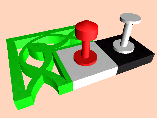
CHESS 3D font.
This font is designed so that when it is used with the Serif ImpactPlus program a three-dimensional chess set may be modelled.
The various pieces are encoded as letters of the alphabet. There are the six pieces of ordinary chess together with various pieces for Carrera's Chess and my own inventions of Herb garden chess and Tree garden chess.
For each piece the idea is to load that character into the 3D workshop of ImpactPlus and produce a rotated object from it, aligning the point one quarter from the left of the glyph (where there is a change of direction of the contour) over the spin axis of the 3D workshop.
Upon leaving the 3D workshop pieces need to be sized to the correct relative sizes. All are produced as 20 units in each of the horizontal directions. The vertical heights are as stated. The vertical postion needs to be one half of the height in each case, as vertical position is measured from the centre: this then means that the bases of the chess pieces are all at the same level.
Please note that the diameter of 20 units in the paragraph above is not a mistake for 30. The aspect ratio of the glyphs in the font would need a diameter of 30 units if the aspect ratio of the glyphs of the font were to be preserved in the three-dimensional model.
The number next to each type of piece below is the suggested height in ImpactPlus measurement units.
40 k king
40 q queen
35 b bishop
30 n knight
30 r rook
20 p pawn
The extra pieces for Carrera's Chess are as follows. These are also used in Herb garden chess.
30 h champion The same glyph is also available as c
35 e centaur
Tree garden chess uses all of the above pieces together with the following, though the marquess is not in the basic Tree garden chess game yet is used in a variant of Tree garden chess, named 'Tree garden chess, the game of the marquesses'.
30 a earl
30 v viscount
30 m marquess
The champion has the combined moves of a rook and a knight.
The centaur has the combined moves of a bishop and a knight.
Please consider that a knight is regarded as a 2,1 jumping piece.
The earl is a 3,1 jumping piece. An earl always remains on the same colour square as when it started.
The viscount is a 3,2 jumping piece.
The marquess is a 4,2 jumping piece. A marquess always remains on the same colour square as when it started.
----
The board border units from Quest Chess are added, encoded as I .. P.
Space and W are blank, set to a width of 2816 font units.
B and * are set to a solid black square, ! to a Quest Chess diagonal background, & to the chess motif of Quest Chess.
The @ is set to the shaded surround of Quest Chess, just in case it is needed.
All of the board units could be made as extruded items 40 by 40 with thickness 10 and vertical position -5 within ImpactPlus, making all of them unbevelled. However, those sizes are not essential as long as consistent sizing amongst the items is used.
An image exported from ImpactPlus showing some objects modelled using the CHESS 3D font. Please note that the board and border units need rotating by 90 degrees after production within the 3D workshop of ImpactPlus so as to be in the correct orientation for the model. The 90 degrees is set within the leftmost angle column of the status panel of ImpactPlus with the object selected.
Stones font.
The Stones font currently has capital letters A to Z encoded as both A to Z and as a to z. A solid item is encoded as an @ symbol.
Sculpture Garden font.
This is a "design in progress" project. Displaying the font as a text file provides some notes about the project.
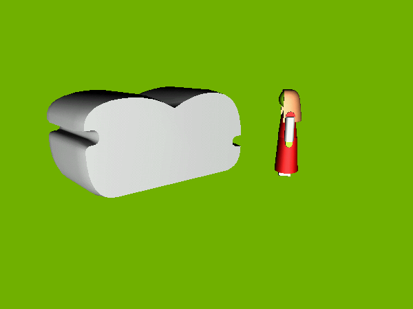
An image by William Overington Copyright 2005 William Overington
This image was produced on Saturday 20 August 2005 as an example of the use of my font Sculpture Garden version 0.04.
The image was produced using the Serif ImpactPlus program, producing a bmp file and the gif file was produced from the bmp file using Paint Shop Pro 7 using an Optimised Octree cut.
The three-dimensional model of the lady is simply copied-in from some previous attempts at three-dimensional modelling using the ImpactPlus program. She is included so as to indicate the size of the sculpture.
This pdf document was produced using the 3D capability of Serif PagePlus 9.04 together with version 0.05 of the Sculpture Garden font.
For Supermarket Wall Signs font.
This is a font where all of the letters and digits are designed so as to be each in one piece with the idea that they could be made in solid form, such as in green plastic with an x height of about 150 millimetres and about 7 millimetres thick and could then be mounted on walls. Words such as caf�, which contain an accented character, are interesting when displayed in this font. Certainly, some accented characters are more effective than others due to the making of each letter to be in one piece being easier with some letters than with some others. The font supports English, Old English, Welsh, Latvian and various other European languages. Please note that the punctuation signs are not all each in one piece.
It will be interesting to know if the font is ever used for supermarket wall signs. The font will also hopefully have other applications, both in architecture and in print. Maybe a phrase such as art gallery would look good in the font. I tried it at 48 point in Microsoft WordPad using the colour which Wordpad calls Lime. At 48 point in Microsoft Paint I tried various combinations of foreground colour and background colour, including red upon yellow and yellow upon a darker red (red=204, green=0, blue=0).
The letters could look good in various materials such as in aluminium and in copper.
Could part of the inside walls of some supermarkets and maybe even some floor space be used as art galleries so as to make art galleries more accessible to people in rural areas? Certainly the range of exhibits possible would not be the same as in a regular art gallery, yet what could be done?
Paper Simulation font.
This font has only three useful glyphs, namely at space, - and E. When the - and E are used at 72 point this font can produce a simulation of the lines in antique laid paper. The glyph encoded at the - position produces the basic lines and the glyph at E produces the basic lines together with an E from the Chronicle Text font superimposed upon it. The font can be used to produce a background layer in a pale colour upon which text can be added in a darker colour using an ordinary lettering font. This can produce an effect of text upon antique laid paper.
Here is a design for some basic paper.
------------
------------
------------
------------
------------
------------
------------
------------
------------
------------
------------
------------
Here is a design for some watermarked paper.
-E---E---E--
------------
---E---E---E
------------
-E---E---E--
------------
---E---E---E
------------
-E---E---E--
------------
---E---E---E
------------
The above design may not look too good on this web page, as the width of a - character and an E may well not be the same in the display font. However, in the Paper Simulation font, the glyphs encoded at - and E are both of the same width and also equal in width and height.
The font can be used to produce a simulated paper background in pdf documents using a program such as Serif PagePlus 9.04. The font can also be used to produce a simulated paper background in graphic designs using a program such as Microsoft Paint.
Here is an example produced using an earlier, development, version of the font. The simulated paper characters are used at 72 point. A useful technique if studying the simulated paper effect is to view the display at 800% in Acrobat Reader.
Font of Spaces.
This font contains glyphs for U+2000 to U+200B in a font with ascender of 2048 font units and zero descender. The purpose of this font is that hopefully it will be of use in conjunction with text fonts which do not contain glyphs for U+2000 to U+200B if spaces of various widths are required. For such use, use of U+2002 to U+200B is suggested. If using Alt codes, U+2002 is Alt 8194, U+2003 is Alt 8195, U+2004 is Alt 8196, U+2005 is Alt 8197, U+2006 is Alt 8198, U+2007 is Alt 8199, U+2008 is Alt 8200, U+2009 is Alt 8201, U+200A is Alt 8202 and U+200B is Alt 8203. Displaying the font as a text file provides some notes, as below.
U+2000 1024 font units
U+2001 2048 font units
U+2002 1024 font units
U+2003 2048 font units
U+2004 682 font units
U+2005 512 font units
U+2006 341 font units
U+2007 1024 font units
U+2008 512 font units
U+2009 409 font units
U+200A 128 font units
U+200B 88 font units
U+E700 STAFF, which is a Private Use Area item, is included so that the font can be picked up by programs which will only pick up fonts which contain a printing character.
Crop Marks font.
This font was produced to facilitate the production of the label for a CD onto a sheet of A4 size paper with crop marks for cutting the paper. The label being for one-off or small quantities using desktop publishing facilities.
The idea is that using a desktop publishing package this font could be used in a separate layer so as to produce crop marks around the edge of the label.
At 24 point on the Windows platform the crop marks should be precise at one pixel wide.
The font has the crop marks encoded as digits 1, 2, 3 and 4 on a square body.
Various spaces are also encoded.
The space character is a square space.
The h is a half-width space.
The q is a quarter-width space.
The e is an eighth-wiidth space.
The s is a sixteenth-width space.
The t is a thirty-secondth-width space.
The p is also a thirty-secondth-width space, a pixel-width at 24 point in Windows.
In use, the font is treated by the desktop publishing program PagePlus as an ordinary font, so blank lines can be added using the RETURN key.
Here is a font which is in development.
Eutopian Architecture
I have produced a pdf version of my web page about my idea for housing.
The web page is still available.
The Design for Manufacture competition now has its own webspace.
http://www.designformanufacture.info/
I have noticed that there are various fonts available which are based on the lettering produced by architects. For example, fonts with the lettering of Frank Lloyd Wright and Charles Rennie Mackintosh.
http://www.p22.com/products/flw.html
http://www.p22.com/products/fllw.html
http://www.p22.com/products/fllwterra.html
http://www.charles-rennie-mackintosh-font.co.uk/
So, as I like imaginative futuristic architecture I thought that I would try to design and produce my idea of an architectural font for imaginative futuristic architecture.
Here is a font which is in development.
Sonnet to a Renaissance Lady
This font is a TrueType font. It is not an OpenType font. However, the font does contain some ligature glyphs mapped into the Unicode Private Use Area and also some alternate glyphs mapped into the Unicode Private Use Area.
The basic ligature glyphs which are not in regular Unicode are mapped into the range U+E707 to U+E7BF using the mappings of the golden ligatures collection.
golden ligatures collection documents
However, those documents have not been updated for some time and the Quest text and Chronicle Text fonts each have ligature glyphs within the range U+E707 to U+E7BF which are not listed in those documents.
The alternate glyphs, including some alternate glyphs for ligatures, are mapped into a font-specific type tray from U+E421 upwards. The decimal equivalent of the hexadecimal value E421 is 58401.
The type tray may be thought of as a convenient way of storing glyph artwork for possible future use in an OpenType font whilst allowing the glyphs to be directly accessed using the present font.
In order to support research, this font, from version 0.18, has zero width glyphs in U+EF01 to U+EF07 and also, in fact, in U+EF00, in case it becomes needed during the research.
This font, Alternate Glyph Selectors V, has a name shortened from Alternate Glyph Selectors Visible.
In order to support research, this font has visible glyphs in U+EF01 to U+EF07 and also, in fact, in U+EF00, in case it becomes needed during the research.
The idea is that if someone produces an OpenType version of the Sonnet to a Renaissance Lady font such that, for example, the sequence g U+EF01 substitutes the alternate g glyph which is presently accessible at U+E421 in the font, then this Alternate Glyph Selectors V font could be used for setting up the U+EF01 character in a document: the font in which the text is displayed then all being changed to Sonnet to a Renaissance Lady.
This is research using Private Use Area characters. If alternate glyph selectors work and provide benefits, then maybe a proposal to include them in regular Unicode can be prepared and submitted, perhaps with the suggestion that they be located in plane 10.
Kern Deco font.
KERNDECO.TTF
KERNDECI.TTF
KERNDECA.TTF
KERNDECB.TTF
KERNDECS.TTF
KERNDECT.TTF
kerndecoexamples.PDF
initiative.PDF
kerndecoexamples_italic.PDF
initiative_italic.PDF
shadows.pdf
The admotifs.PDF publication uses Kern Deco in conjunction with the 10000 font.
Pictures Landscape and Pictures Portrait fonts
These experimental fonts arose as an experiment in producing illustrations looking like displays of smaller pictures as if on the wall of an art gallery, including the edges of the wall.
The Pictures Landscape font can be used to produce a display of an array of landscape orientation pictures using a program such as WordPad. For example, the following.
ABBBBBC
Yet that text set using the Pictures Portrait font also produces a display.
In each case the pictures themselves are as if on an A size sheet of paper, for example, A3 or A4.
The fonts are a matched pair in that, using layers in a desktop publishing package one can have columns of landscape pictures in one layer at one font size and columns of portrait pictures in another layer at a larger font size and overlay the layers so as to produce an illustration looking like a display of columns of smaller pictures as if on the wall of an art gallery. This is facilitated by using, in each layer, the # character to insert a space for the width of a picture of the other orientation.
If using layers for a mixed landscape and portrait effect, then the edges of the wall should be set in only one of the fonts, using an E character where a blank shape is required to give the correct width for where a wall piece would have been used in the other layer. For example, the wall edges using the Pictures Landscape font, with the letter E being used to produce blanks in the layer which used the Pictures Portrait font.
In addition the fonts each contain a line design keyed using a % character, which has the width of the # yet with a horizontal line of the thickness used to represent wall edges in the same orientation font.
The effect of this is so that, for example, one may use the Pictures Landscape font to produce the wall edges for one layer of a two-layer picture, using the % character to produce a piece of wall edge for the gap where the portrait format pictures are to be overlaid using another layer.
This may look extremely complicated when written down, yet is easy to use in practice.
For example, suppose that a landscape layer is constructed as follows, using the Pictures Landscape font.
AB%B%BC
Then suppose that a portrait layer is constructed using the Pictures Portrait font.
##1#3
The portrait layer needs to have a font size just over one and a third times the size of that used in the landscape layer to get a good look to the final picture. It can be a good idea to use a convert-to-curves for the two layers if the particular desktop publishing package being used has that facility.
The designs produced with either or both of these fonts can then have a 3d effect applied to them if the particular desktop publishing package being used has that facility. That can produce quite realistic looking displays, almost as if a view of a wall in an art gallery. Such 3d effects often have an extrusion thickness effect. It needs a small value. Such 3d effects often have a bevel effect. Please choose an option of none if possible. Please note that each small picture can be set to have a different colour.
Here is a font which is in development.
Invention font
Here are some samples of some fonts which are in development being used.
Invention font.
Calligrapher font.
Some A3 size publications.
quest4.pdf
impression.pdf
future.pdf
heavy.pdf
Readers are invited to look in the Gallery section at http://forum.high-logic.com as well.
D1234EF
D5678EF
D9000EF
DEEEEEF
GHHHHHI
D1#3#EF
D5#7#EF
D9#0#EF
DE#E#EF
GH%H%HI
##2#4