|
1
|
- 79% of users scan; only 16% read word-by-word
|
|
2
|
- Users comment on the content first
|
|
3
|
- Reading from computer screens is tiring for the eyes and 25% slower than
paper
|
|
4
|
- Users rarely looked directly at the scrollbar
|
|
5
|
- Write no more than 50% of the text you for hardcopy -Shorten that Text!
Cut Any Paper-Based Text by 50% Rewrite to shrink by 50%. Delete Fluff
- Write tighter than you would for print.
- Organise your text in more open, loose format, with paragraph breaks and
headings
- Split writing into smaller, coherent pieces Use several smaller pages
rather than one very long page. Visitors don't want to scroll.
|
|
6
|
- Black text on a white background is the easiest text to read.
- Text must have good contrast in order to be easily read. Hence, text
should be displayed in a dark color on a light background or the
reverse. The smaller the copy the more critical contrast becomes. The
larger the copy the less critical contrast becomes.
- A SANS-SERIF typestyle such as Helvetica & Arial, Verdana is best.
- Be consistent in how you design headings
|
|
7
|
|
|
8
|
|
|
9
|
|
|
10
|
- Visitors level of interest in every web page. none - some - strong
interest – write for all ie. no interest - title only ….1 sentence or 1 paragraph
summary ….major points - minor
points
- A web page which caters to each level of reader interest will result in
more satisfied visitors.
- A user is happy when they get the information they want quickly and
easily.
|
|
11
|
- Write 50% less text.
- As users don't like to scroll. don't have long continuous blocks of text
- Try to keep it all on one screen
- Use highlighting and emphasis to make important words catch the user's
eye.
- Blocks of text.
|
|
12
|
- Make text short by splitting the information up connected by hypertext
links
- Writing for interlinked information spaces is different than writing
linear text. rhetoric of departure and rhetoric of arrival
- When users link to a page from a search engine, they should know
immediately how the page relates to their query
- Intro page with links to content pages
- Each page focuses on one topic/theme
- All pages should have unique titles
|
|
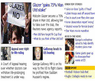
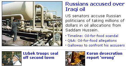
13
|
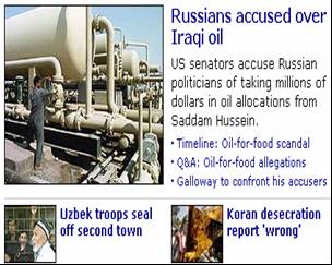
- Faces in images attract more eye fixations on homepages and multiple
faces in photos attract more viewers
- Smaller photos just don't attract viewers -- they are often ignored
entirely
- People routinely click on photos.
- Should complement/relate to content
|
|
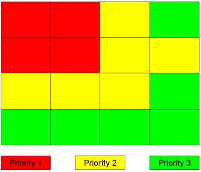
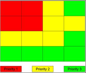
14
|
- Titles that can survive out of context
- Improve scanning simple structures
- Insert meaningful headlines and sub-headings
- Turn any series into a bulleted or numbered List
- Highlighted keywords
- One idea per paragraph
- Opening sentence in a paragraph should
be the topic sentence - Newspaper style
writing - conclusion first – Summary most important -Then get to the
details
|
|
15
|
- a headline has less than a second
of a site visitor's attention.
- the first couple of words need to be real attention-grabbers
|
|
16
|
- Designing Web Usability
Jakob Nielson
- Interface Culture
Steven Johnson
- Information Anxiety
Richard Saul Wurman
- Dust or Magic Bob Hughes
- Understanding Hypermedia 2000
Bob Cotton Richard Oliver
|

 Notes
Notes