Producing colourful lettering using the Microsoft Paint program.
William Overington
Copyright 2002 William Overington
Tuesday 25 June 2002
A useful facility available in the Microsoft Paint program is that of pasting one image upon another using the option that the background colour of the pasted piece is made transparent.
Yet, the Paint program does not determine which is the "background" colour by a technique of looking at what a human might regard as "the background" of the pasted piece, but by using as the background colour whichever colour happens to be set as the background colour in the colour box at the time of the pasting.
This means that if the artist using the Paint program chooses to set, as the background colour in the colour box, the foreground colour of the pasted piece, then the Paint program will happily use that foreground colour of the pasted piece as its designated "background colour" for the purposes of transparent pasting.
This opens up lots of interesting possibilities once one understands what is happening.
Suppose, for example, that the pasted piece is from a Print Screen copy of a large capital letter which was produced using WordPad. Suppose that the letter is blue upon a white background. Suppose that one now pastes that piece onto a Paint picture, using a transparent paste with blue set as the "background colour" in the colour box. So, the letter is transparent. So, whatever was in the original picture shows through the shape of the letter, but not elsewhere. Suppose that the original picture was a square of textured gold. The result is a white background, with a letter of textured gold upon it.
This picture can then be copied onto the clip board and pasted onto a background picture, pasted transparently with white as the background colour in the colour box for this paste. Thus, by also using skills explained in previous documents in this series, a picture of a large capital letter in textured gold upon a scrollwork pattern constructed using Bézier curves can be produced.
This use of a transparent colour facility works not only for pasting from the clip board but also for pasting from a file, so if it is more convenient to save the intermediate stages to a file, then it is a good idea to do so. Also, on many PCs it is possible to have two instances of Paint running at the same time and to copy and paste from one instance of Paint to another instance of Paint. Saving to a file or running two instances of Paint can be necessary in order to carry out some sequences of pasting. Each artist needs to find the way that suits him or her best, because sometimes images can be in the wrong order in the sense that one would like to paste transparently onto the image which is on the clip board. Pasting one image onto another upon the clip board is not possible, so the image on the clip board first needs to become actually on the screen in a running instance of Paint.
In presenting this document a problem is that some of the pictures are on a white background, so presenting them directly would not show properly against the white background of the document. That would not matter were those pictures being produced as finished art or as finished illustrations and were being presented as such in a document. However, in this document those pictures are used as part of the process of explaining how to produce art and illustrations, so it is important that the reader has an idea of where are the borders of the illustration. I am therefore presenting those pictures each upon a dark red panel. That panel is part of this HTML document, not part of the original picture. When producing artwork using the techniques described in this document you do not need a dark red surround to your picture.
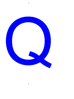
Here is a 200 point capital Q in Arial in blue upon a white background produced using WordPad and Paint. It is in a picture which has a white background and which is 300 pixels wide by 300 pixels high.
|
|
This letter was produced by producing in WordPad three rows of text, centred. The first and third rows each contained an 18 point full stop. The middle row contained a 200 point capital Q. This picture is produced deliberately uncentred in order to demonstrate the alignment technique.
|
|
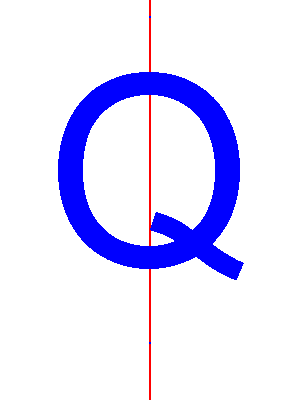
A background of 300 pixels wide by 400 pixels high with a construction line was produced. The centre line is 2 pixels wide, which matches the 2 pixel width of the 18 point full stop character in Arial and thus permits there to be 299 white columns on each side of the red line.
|
|
The finished letter was produced by using 8x magnification and pasting the large letter Q with the full stops transparently with white as the transparent colour, moving the pasted piece so as to align the full stops onto the red line.
|
|
The red line and the full stops were then filled with white so that they could not be seen. The picture was then trimmed on the upper and lower edges so as to make it 300 pixels high, judging the vertical position of the letter by eye so as to make it centred just a little above the centre of the picture. This produced the letter Q centred horizontally within the background. This is a display of the same .gif file as was used for the first picture in this document.
|
|
Here is a piece of gold texture from the texture gallery elsewhere in this webspace.
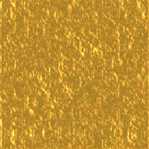
The next stage is to produce within Paint a picture which contains the gold which is the same size as the picture which contains the letter Q, namely 300 pixels wide by 300 pixels high for this example. This picture containing the gold needs to have gold wherever the letter Q is to be placed, though need not have gold elsewhere. For this example, as the piece of gold is 300 pixels wide by 300 pixels high there is no problem, for the gold will fill the picture. However, for a larger picture where just a gold initial letter is being decorated, the piece of gold may be set upon a larger area of some other colour. Also, for a small picture such as this it is possible to have some plain area of colour added to one side of the piece of gold and a piece of gold of the same size clipped off the opposite side so as to locate a highlighted portion of the gold in some particular place within the initial letter if so desired. For this example, however, the letter is just placed upon the gold as it stands and the design is simply what is produced without making any such adjustment.
Here is the letter Q pasted onto the gold texture with blue set as the transparent colour for pasting. I used the gold from above copied using the Print Screen facility, pasted it into Paint and then trimmed the picture so produced so as then to produce a piece of gold 300 pixels wide by 300 pixels high ready to have the letter Q pasted onto it. When I used Paint to produce a .gif file there was a noticeable, yet not too strong, change of colours in the colour of the gold, making it look a little darker in colour. I have used that .gif file for this document. The way to avoid the darkening would have been to use a saved copy of the .bmp file and load it into a package such as Paint Shop Pro and save it with an Optimized Octree colour conversion. I mention this in case you get the chance to use a package such as Paint Shop Pro at some time. However, this .gif file does look acceptable.
|
|
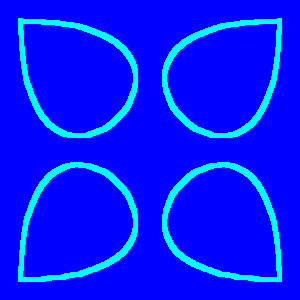
Here is the background design, produced in Paint using Bézier curves. I started with a plain white square area 260 pixels wide by 260 pixels high, and using 8x magnification drew a red construction line one pixel wide around the edge. I then used flip horizontal and flip vertical and the attributes facility in order to add 20 pixels to each edge, thus making a picture 300 pixels wide by 300 pixels high containing a red square. I then added some green lines so as to produce a cross wires effect at each of the corner points of the red square. I then set the line width to five pixels wide. I then added blue Bézier curves using the curve tool. When I had completed the design, I changed all of the blue to the cyan colour and then changed all of the white, green and red to blue.
Here is the gold textured letter Q pasted onto the background design with white set as the transparent colour.

Having used to advantage the fact that the Paint program will accept as the "background colour" a colour which is, to the artist, the foreground colour, we can, in fact, go a little further in that a colour which is neither the foreground colour nor the background colour to the artist can also be used to be the transparent colour.
Consider the following texture, also from the texture gallery of this webspace.
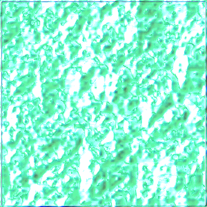
The cyan coloured scrollwork in the initial letter thus produced can be changed to become a textured design by pasting onto a copy of the above background using cyan as the chosen "background colour" in the colour box of the Paint program.
Please note that at each stage of producing this document the examples were produced using .bmp files. The two texture files were produced using the Paint Shop Pro program using the Blade Pro plug-in. The other .gif files shown in this document were each produced individually just for this document and not used for subsequent stages. The pieces of texture used in Paint to produce these other pictures were produced using Print Screen copies of the textures as displayed in the draft of this document using the .gif files from the texture gallery.
Hopefully the use of this technique will increase your enjoyment of using the Paint program.

Copyright 2002 William Overington
This file is accessible as follows.