Some fonts designed by
William Overington.
William Overington
Copyright 2003 William Overington
Monday 24 February 2003
Here are some fonts which I have designed, all available for free download.
These fonts were all produced using the Softy program.
Each font contains one or more glyphs.
Hot Beverage font.
This font contains a glyph at U+2615 for Hot Beverage, which is decimal 9749. The same glyph is also available encoded to respond to a lowercase h character, for convenience of use when used with the Microsoft Paint program for making graphics. The space character U+0020 is also included in this font, implemented as a square space.
Here is a transcript of some text which I posted to the Unicode mailing list on 17 February 2003.
Hot Beverage font.
Thinking that the new to Unicode 4.0 symbol U+2615 Hot Beverage might be very useful in the preparation of meeting agendas and the like and also wishing to try to design a glyph which would look good particularly at a 12 point size in documents, I have produced a font named Hot Beverage which I have now added into our family webspace.
The font can be downloaded from the web from the following address.
http://www.users.globalnet.co.uk/~ngo/HOTBEVER.TTF
The font contains the Hot Beverage glyph which I have designed, accessible at U+2615, which is decimal 9749, and also at lowercase h, for convenience of use when used with the Microsoft Paint program. The font also includes a space character.
I have tested the font with WordPad and Word 97. It looks quite good at 12 point in black, as in an agenda document for a meeting. It also looks good in the colour which WordPad calls green, which is a dark green colour, at 300 point, and also looks good in a fun logo at 36 point following the wording Peppermint Tea Shoppe in Old English Text in the same dark green colour. Various other sizes mostly look good though 18 point does look a bit strange.
An experiment with PowerPoint produced a nice slide with the following, centred in a text box, in black at 36 point.
There will now be an intermission
for refreshments.
Below which, in colour red=51, green=204, blue=51 at 72 point, centred in a text box, the Hot Beverage glyph.
Hopefully this font will be a useful item on computers around the world.
William Overington
18 February 2003
End of transcript.
Umbrella with rain drops font.
This font contains a glyph at U+2614 for Umbrella with rain drops, which is decimal 9748. The same glyph is also available encoded to respond to a lowercase u character, for convenience of use when used with the Microsoft Paint program for making graphics. The space character U+0020 is also included in this font, implemented as a square space.
While testing the font, I found that a design in blue at a 72 point size in Paint, produced by using the Text tool, selecting the Umbrella with rain drops font and then entering the following text, looked good.
u u u
u u
u u u
UMBRELRD.TTF, Umbrella with rain drops
Courtyard codes for colours font.
I produced this font as a tool for research in multimedia authorship. I have devised glyphs for 19 of the courtyard codes relating to text colour and encoded them in a font. These codes are all in the Private Use Area and so the code point allocations and the glyphs are not part of the Unicode Standard. The space character U+0020 is also included in this font, implemented as a square space.
People interested in having a copy of this font may find the following documents useful in applying the font.
http://www.users.globalnet.co.uk/~ngo/courtcol.htm
http://www.users.globalnet.co.uk/~ngo/court000.htm
The codes implemented in this font are as follows.
U+F3AC, U+F3BA, U+F3BB, U+F3E0 .. U+F3EF together with the space character U+0020.
The decimal equivalent values, useful for entering characters using the Alt method in WordPad are 62380, 62394, 62395, 62432 .. 62447 respectively for the colour codes and 32 for the space character, though using the space bar on a keyboard is the preferred method for keying a space character.
The font is intended for use primarily at a 12 point size on a PC, so the glyphs have been designed to produce a crisp display at that size, each glyph being 16 pixels square on a PC display at a 12 point size.
An important consideration is that one use of this font will hopefully be in the preparation of text files which will be part of multimedia packages broadcast using the DVB-MHP (Digital Video Broadcasting - Multimedia Home Platform) system.
For the avoidance of doubt, this font is not intended to be broadcast or used by end users of the DVB-MHP system. It is not part of the DVB-MHP standard at all and its use is not obligatory in any way.
My thinking is that if the colour codes in the document http://www.users.globalnet.co.uk/~ngo/courtcol.htm mentioned above do become used within some multimedia programs written for the DVB-MHP system, so that various content authors may prepare text files including these colour codes, so that the text files are broadcast with a Java program that uses such a text file as data input and produces a colourful display on the television screen, then this font may be very useful to the author of such a text file who is preparing the text file on a PC. Such a person may need to use a program such as Microsoft WordPad to prepare the text file, so this font might be very useful in that situation. This is currently at a research level, so possibly nothing may come of it, yet it is possible that these colour codes might become widely used in the future for some multimedia broadcasts upon the DVB-MHP platform, in which case this font may perhaps become a very useful item to have available. I am thinking particularly of educational texts where the person producing the text file may not have lots of specialist DVB-MHP content authoring tools available. For example, such a person may be producing text files at a PC in a library using just standard packages, though may be able to get permission to add this font into the system.
I have been experimenting with using the font with WordPad and Word 97 on a PC, where the glyphs give a monochrome indication to an author of which colour is being used. For example, I mixed English text in the Arial font with codes from this font in one document. The whole text of English and colour codes can then be copied onto the clipboard and pasted into SC UniPad (downloadable from the http://www.unipad.org webspace) in order to produce a compact file without the text formatting of WordPad or Word 97.
I am hoping to carry out some experiments whereby such text can then be pasted into a text box of a Java applet and produce appropriately coloured text.
I have found it interesting to design glyphs to represent colours in monochrome.
COURTCOL.TTF, Courtyard codes for colours
Ultramarine lapis lazuli font.
On Saturday 22 February 2003 I designed and produced the Courtyard codes for colours font.
That evening I watched a television programme about the way that the artist Titian had painted. The programme included some practical experiments in producing oil paints as Titian would have used them. Ultramarine paint was produced by grinding lapis lazuli. As I had been designing the glyphs for the Courtyard codes for colours font I thought that it might be a nice idea to devise a special glyph for ultramarine produced using lapis lazuli. I designed the glyph and decided to produce a special font for the character, placing the character in the Private Use Area encoded at U+E7C7. The decimal equivalent value is 59335. The same glyph is also available encoded to respond to a lowercase u character, for convenience of use when used with the Microsoft Paint program for making graphics.
I then thought that it might be nice to add a complementary glyph encoded at U+E7C8, so that a sequence of U+E7C7, U+E7C8, U+E7C7, U+E7C8, U+E7C7, U+E7C8 and so on, on each of several consecutive lines of the display, would produce a design.
The decimal equivalent value of U+E7C8 is 59336. The same glyph is also available encoded to respond to an uppercase U character, for convenience of use when used with the Microsoft Paint program for making graphics.
When using the Microsoft Paint program such a design can be produced by using the Text tool, selecting the Ultramarine lapis lazuli font and then entering the following.
uUuUuUuUuU
uUuUuUuUuU
uUuUuUuUuU
uUuUuUuUuU
uUuUuUuUuU
Readers might like to have a look at the following document and consider using the techniques described therein so as to use such a pattern design as a texture design for filling an area of a graphic, that area being either lettering or otherwise.
Producing colourful lettering using the Microsoft Paint program.
One could even find a picture on the web which uses ultramarine, make a Print Screen copy, paste it into Paint and then use the Pick Color tool within Paint to select a colour in which to key the uU.. sequence mentioned above. Or maybe find a picture of a specimen of lapis lazuli and use that colour directly.
The space character U+0020 is also included in this font, implemented as a square space.
ULLAPLAZ.TTF, Ultramarine lapis lazuli
I hope that you will enjoy collecting and using these fonts.
Tuesday 25 February 2003
Map flags font.
This font contains a glyph at U+2690 for White flag, which is decimal 9872 and a glyph at U+2691 for Black flag, which is decimal 9873. The same White flag glyph is also available encoded to respond to a lowercase w character and the same Black flag glyph is also available encoded to respond to a lowercase b character, for convenience of use when used with the Microsoft Paint program for making graphics. The space character U+0020 is also included in this font, implemented as a square space.
The glyphs are designed to look good at 12 point and 18 point in particular and also to provide an interesting display when used at large sizes such as 300 point.
Monday 3 March 2003
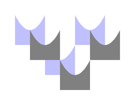
Parabola font.
This font contains a glyph at U+E7C9, which is decimal 59337, which is in the Private Use Area. The glyph is of a solid square from which a piece which has an edge in the shape of a parabola has been cut. The same glyph is also available encoded to respond to a lowercase p character, for convenience of use when used with the Microsoft Paint program for making graphics.
A good way of using this font is with Microsoft WordPad and Microsoft Paint used together. The following document might be of interest.
Using the Microsoft WordPad program to support text input for the Microsoft Paint program.
The space character U+0020 is also included in this font, implemented as a square space.
An interesting point is that the parabola is produced directly by utilising the fact that TrueType fonts work using Bézier curves. The parabola is produced by producing one Bézier curve which is a parabola, not by using a series of Bézier curves so as to fit a piecewise approximation against a desired curve.
A 200 point character in WordPad, then copied onto the clipboard using the Print Screen facility and pasted into Paint, is a good starting point for experimentation. Once the design is in Paint, it can be rotated if desired. A copy of the rotated design can be made, filled in a different colour and then, using 8x magnification, pasted precisely over the original using transparent pasting so as to produce various curved shapes, depending upon which of the colours is used as the background colour for the transparent paste.
Lots of graphical designs can be produced with the Paint program starting with this font by using various combinations of rotating, offsetting and repeating of this motif.
Here is an example produced using the Paint program, here presented as a .gif file. For this design, repeating of the motif and offsetting are used. Rotation of the motif is not used for this design.
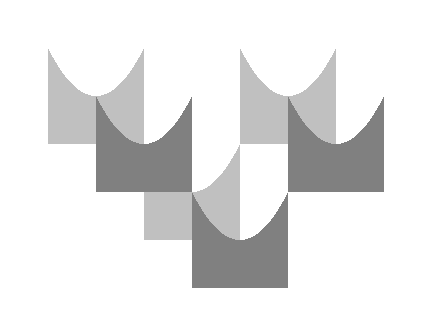
A feature of Paint is that it can distort some colours, particularly light grey, when saving as a .gif file, so a good practice is to first save the picture as a .bmp file before trying the saving as a .gif file from Paint.
In the event of colour distortion with Paint, which occurred in this graphic, the .bmp file can be used at a later time to produce a .gif file using a package such as Paint Shop Pro, which, for a graphic with less than 256 colours, can be used to produce a .gif file with the same colours as the original graphic, provided that one sets the colour selection method used for the conversion from .bmp to .gif as Optimized Octree.
Here is the graphic as originally intended.
It was produced by typing letter p and space alternately along rows in 72 point using the Parabola font in the Paint program: for this graphic, three uses of the letter p were used. A copy was made, the colour of the copy was changed and then, after a location point 48 pixels in each direction from the lower left corner of one of the individual motifs had been drawn in temporarily by drawing two rules, each rule 48 pixels long, at right angles to each other, the copy was pasted over the original at 8x magnification. Copies of the 48 pixel rules were then used so as to locate the boundaries of the graphic for accurate trimming at 8x magnification. In the above, various copies of the original 48 pixel rule were used, some rotated through 90 degrees, thus there were horizontal rules and vertical rules used in making the graphic. The various rules were then coloured in using the background colour, white, so that they disappeared from the image.
The rules used were 48 pixels long because the point size used for this graphic was 72 point. The length of 48 pixels is because on a PC, a solid square at a particular point size is 4/3 times that point size in pixels square, this means that 72 point uses a 96 pixel by 96 pixel square, and half of 96 is 48, a factor of one half being used because an offset of half a square edge in each direction was desired for this graphic.
Notwithstanding the comment above about colour distortion happening in some circumstances, Paint is very good for producing .gif files which preserve colours of most of the colours in the Paint Color Box, so Paint is a good program for producing artwork for use on the web in many circumstances.
I hope that this parabola font will provide you with enjoyment in producing graphic designs.
Friday 21 March 2003
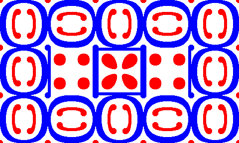
Old meets new border units font.
This font, which is not a Unicode font, contains 32 ornament glyphs, designed so as to be influenced by some of the letterpress ornaments of the sixteenth century and some of the graphics of the present century and the twentieth century.
The font is intended primarily for use within the Paint program for producing graphic designs, though could also be used in wordprocessed documents if desired.
The ornaments are assigned to keyboard keys so that blocks of four keys produce sets of ornaments.
For example,
qw
as
produces a unit. However, sequences such as
sa
wq
where the same ornaments are used in a different order can also be tried.
Use in wordprocessed documents would be monochrome, yet when using Paint, the graphics may be coloured once they are produced. For example, the following graphic was produced using the Paint program by keying, at 36 point, in red, the following text, then filling the main block of colour with blue.
qwerqwerqw
asdfasdfas
qwtybntyqw
astym,tyas
qwerqwerqw
asdfasdfas
OLD_NEW_.TTF, Old meets new border units
Friday 21 March 2003
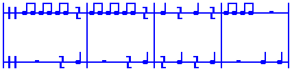
Chloe and Phil music fonts.
This is a four font set.
Chloe and Phil music fonts can be used to produce graphics showing the scores of short pieces of percussion music using untuned percussion instruments which each produce one note. People can hopefully enjoy playing such music and in writing new pieces.
The four fonts each contain the same glyphs, yet the glyphs are accessed in different manners.
Chloe and Phil music font.
In these three fonts the glyphs are accessed using code points from within the Private Use Area of Unicode. The idea is that this font is a research item as I am hoping that it can be used as the source font for producing a Portable Font Resource PFR0 format font for broadcasting on the DVB-MHP interactive television platform. In that manner, Chloe and Phil music scores can hopefully be broadcast around the world. Three versions are supplied, CPMUSICU.TTF, CPMUSICV.TTF and CPMUSICW.TTF. The first two have the same font name. The second and third also have a space character at U+0020. The intention is that the first, CPMUSICU.TTF, will be used to produce a PFR0 font. The CPMUSICV.TTF font is supplied as an alternative for that purpose, just in case it is needed due to the PFR0 font format or the DVB-MHP platform. I have no reason at present to think that it will be needed, but experience with the Windows platform leads me to think it wise to provide CPMUSICV.TTF, just in case it is needed. The third font has a different font name so that it can be used independently on a PC running the Windows platform so that, for example, Microsoft WordPad and Microsoft Word can be used for content authorship to prepare diagrams in text format for broadcasting. Please use U+E4DF as the spacing character, not the ordinary U+0020 character. The U+0020 character is in this font to keep the operating system happy and is not intended for use in producing documents. Please know that in my tests I have been unable to get the U+E4DF character into Word using the Insert | Symbol feature of Word. However, I have managed to get a U+E4DF character into Word by generating it within SC UniPad and then copying it into the Word document using a copy and paste process. Also, use of Alt 58591 within WordPad can generate the U+E4DF character and it can be copied across into Word. Later copying and pasting from Word to SC UniPad verified that this worked.
Chloe and Phil music font a.
In this font, in the file CPMUSICA.TTF, the glyphs are accessed using ordinary keyboard keys. This means that this font can be used with the Microsoft Paint program for producing graphics.
Readers might like to learn more about Chloe and Phil.
Chloe and Phil contribute to content for Astrolabe Channel!
Chloe and Phil music is intended to be played either on professionally made untuned percussion instruments, such as a triangle and a drum and so on, or using improvised instruments made by tapping various items and so on. It is intended to be fairly slowly paced as a participation music of which most people can join in the playing. Pieces can be quite short. Please compare short, interesting pieces in this music format with haiku in the world of poetry.
The fonts all contain at least 11 glyphs, coded as in the following table. In these fonts, the first 10 of these items are all encoded as a square glyph, 2048 font units wide, and the last item, the bar line, is encoded as 168 font units wide. Some of the fonts contain an additional glyph, with a space coded at both U+0020 and U+E4DF: this is because of practical aspects of using the fonts on a PC using the Windows operating system. Please note that U+E4DF is defined in this character set as a square space. When these codes are used in conjunction with some other font which provides the text of a document, U+0020 will be the space of the text font, which space may well not be a square space, which is why this character set and the fonts implementing it include a specifically square space. The fonts are designed to look good at 18 point on a PC, as that will often be 24 pixels when using the Paint program. The underlying design reason for that size is so that the glyphs can hopefully be used at 24 point on the DVB-MHP system. That is, however, a matter for research and development, research and development of how to use specialist symbols on the DVB-MHP platform using a font which has been broadcast when the font is to be used in conjunction with text which is displayed using the built-in font of the television set. This set of music symbols for basic percussion music is intended to be a set of test symbols which will test the method of using a broadcast font on the DVB-MHP system in conjunction with the built-in font while also providing some information of which an end user may make use.
| The code point in both hexadecimal and decimal. | The meaning within this Private Use Area character set. |
The key to which the meaning is mapped in version "a".
|
U+E4C0 58560
|
Empty staff line.
|
e
|
U+E4C1 58561
|
Percussion clef symbol.
|
p
|
U+E4C2 58562
|
Individual note.
|
i
|
U+E4C3 58563
|
Double note.
|
d
|
U+E4D0 58576
|
Left hand part of centre part of whole bar rest.
|
r
|
U+E4D1 58577
|
Right hand part of centre part of whole bar rest.
|
s
|
U+E4D2 58578
|
Left hand part of half bar rest.
|
u
|
U+E4D3 58579
|
Right hand part of half bar rest.
|
v
|
U+E4D4 58580
|
Quarter bar rest.
|
q
|
U+E4DF 58591
|
Unit width space.
|
space
|
U+E4E0 58592
|
Bar line.
|
b
| |
Here is a short piece showing the use of the glyphs, produced using the Paint program. It is intended as a short piece for two players. Perhaps the upper line for a triangle and the lower line for a drum, or using whatever improvised instruments are available.
Here are the links for free download of the four fonts.
The following font is intended for conversion to PFR0 for interactive television. The glyphs are encoded at code points in the Private Use Area. This font may display wrongly upon a PC based system.
CPMUSICU.TTF, Chloe and Phil music font
The following font is as above but also has a space at U+0020, just in case that is needed for the PFR0 font system running on the DVB-MHP platform. The space to use when designing pictures is still U+E4DF. This font has the same font name as above so that whichever of them is used as the source the result will still have the correct name for the font.
CPMUSICV.TTF, Chloe and Phil music font
The following font is as CPMUSICV.TTF except that it has a different font name so that it can be used with Microsoft WordPad and Microsoft Word to prepare music diagrams which are encoded in the Unicode Private Use Area without conflicting with whichever, if either, font with the name "Chloe and Phil music font" has been used as the "Chloe and Phil music font" on the particular system. The space to use when designing pictures is still U+E4DF.
CPMUSICW.TTF, Chloe and Phil music font w
The following font has glyphs encoded as characters from the ordinary keyboard. It is not a Unicode compatible font. This font is provided so that people who wish to produce artwork for making illustrations, such as by printing a page directly from a wordprocessor or by using the Microsoft Paint program to produce graphics files, can easily have access to the character glyphs for those purposes.
CPMUSICA.TTF, Chloe and Phil music font a
Thursday 8 May 2003
Supplementary note about Quest text.
I have now become aware that there are various errors in some of the Quest text fonts. The Microsoft Word 97 program and the WordPad program running under Windows 98, as far as my own experience is concerned, seem to tolerate these errors and the fonts run satisfactorily in those programs on that platform.
Some of the problems are due to various tables in the font which are generated automatically. These remaining errors relate to Misoriented contours and Intersecting contours.
Most of the Misoriented contours were due to my having produced a grave accent from reversing an acute accent. That error was in 14 characters. Four caron accents had been produced by inverting circumflex accents. The figure 5, the circled figure 5 and the ) character also each had a Misoriented contour, due to being derived from a figure 2 and a ( character. From Quest text 0.72 these 21 errors have been corrected. The report stated 19 Misoriented contours so hopefully the Misoriented contours aspect of the problem is now resolved. It may be that as two of the caron accents were from Z and z that these were not counted due to the presence of an Intersecting contours error in the glyph as well.
The Intersecting contours errors arise because I was unaware that having overlapping contours was an error. Some are in characters K, k, R, X, x, Z and z. However there are others, including many of the f and long s ligatures. This matter of Intersecting contours will take longer to resolve than did the matter of Misoriented contours.
It is not clear to me as to whether the remaining problems of the font tables and the overlapping contours are serious, though I will try to resolve them anyway. The font works well within the circumstances in which I have used it, yet that might be due to the Microsoft programs or the Microsoft platform being tolerant in the matter.
There seems to me at present no reason why the font should not continue to be available and used, yet I feel that it is only correct to bring these matters to the attention of anyone considering using the Quest text font.
The download page for the latest version of the Quest text font is as follows.
http://www.users.globalnet.co.uk/~ngo/font7007.htm
Saturday 3 May 2003
Quest text font under development.
I am currently designing and producing a font named Quest text.
As I proceed I am placing development versions on the web. The latest version is Quest text 052. I am hoping eventually to produce a version as Quest text and then any future version can also be named Quest text, yet having a different version number viewable by a font viewer yet not built-in to the name of the font. However, while development is proceeding a different font name for each version is useful.
Quest text is designed with the hope of being both clear and elegant at 12 point yet also having a stylish artistic look in very large sizes, such as 288 point.
I am hoping that Quest text will be both a work of art and also a font which has practical use in a number of niche activities, such as displaying Old English and Middle English and in transcribing printed books from olden days, such as eighteenth century English books where there are ct and long s ligatures used in the printing. Use is made of the Private Use Area for characters and ligatures which are not encoded in regular Unicode. I have tried to include all of the ligatures needed for transcribing German Fraktur printing.
In relation to the Middle English character yogh, I have encoded yogh and also I have encoded ezh as, due to a mistake in Unicode 1.0, ezh and yogh were unified as ezh. In view of the fact that there may be legacy files where yogh has been encoded using the ezh code point I felt it desirable to encode ezh in the font as well, so that any such legacy texts would display an ezh rather than the default glyph of the font.
U+021C, decimal 540, LATIN CAPITAL LETTER YOGH
U+021D, decimal 541, LATIN SMALL LETTER YOGH
U+0292, decimal 658, LATIN SMALL LETTER EZH
U+01B7, decimal 439, LATIN CAPITAL LETTER EZH
There are various characters encoded in the Private Use Area.
The codings used are as in the pages introduced and indexed in the following page.
http://www.users.globalnet.co.uk/~ngo/golden.htm
Not all of the ligatures in those pages are implemented.
In addition the following characters are encoded.
U+E75F, decimal 59231, is an abbreviation character used in some Old English documents for the word thaet.
U+EBEF, decimal 60399, has a glyph so that eutocode typography files may be produced conveniently using a text editor if eutocode typography files are used (as at present they are only at the stage of being a suggestion).
Glyphs, of my own design, for ZERO WIDTH JOINER, U+200D, decimal 8205 and U+200C, decimal 8204, ZERO WIDTH NON-JOINER are also included, both for use in the production of eutocode typography files and also for more general use, such as in document transcribing.
http://www.users.globalnet.co.uk/~ngo/ast03300.htm
The font also implements spacing characters U+2000 through to U+200B in relation to the total height of the characters, so that simulation of old handsetting justification of metal type may be carried out using a program such as WordPad. Such a simulation can be helped by using the SC UniPad program which is available from the http://www.unipad.org webspace.
Feedback on the Quest text font is invited. The notification of any errors or problems and the making of requests for additional characters to be included in the font are welcome. Any additional characters suggested may have either regular Unicode or existing Private Use Area encodings, or a new Private Use Area encoding can be devised.
Here is the link for downloading the font.
Monday 5 May 2003
Quest text font development progress.
Here is a later development version of the Quest text font.
There are more ligatures in the Private Use Area using some of the code points in the region from U+E700 through to U+E7FF, which range is from decimal 59136 to 59391, though the addition only use the code points previously published in the web pages mentioned above. There are also some circled digits at U+2460 through to U+2468, decimal 9312 through to 9320, and at U+24EA, decimal 9450. These are included so that if someone is transcribing a document and finds an unknown character, or one not supported in Quest text, then he or she may, if he or she so chooses, use the circled digit character on a temporary basis until the matter is resolved. There are also a few more accented characters added. These are to enable Quest text to support Welsh, though all of the required accented characters for Welsh have not yet been added.
Here is the link for downloading the font.
Tuesday 6 May 2003
Quest text font now available.
The accented characters for Welsh have now all been added together with various other accented characters. I am now uploading two versions of the font to the web. These are the same except for the font name.
Here is the link for downloading the font as part of the development series.
The version of the font with the font name Quest text is in a file which has QUESTTXT.TTF as its file name.
There is now a web page for downloading the latest available version of the QUESTTXT.TTF font. This is started with version 0.71 which corresponds to development font QUEST071.TTF, though whereas QUEST071.TTF will not be changed by any later developments, if any developments take place QUESTTXT.TTF will be the latest available version, produced from the development version.
http://www.users.globalnet.co.uk/~ngo/font7007.htm
Thursday 8 May 2003
Continuing with the Quest text font.
Please see the supplementary note about some problems about the Quest text font. This has been placed at the start of the section about Quest text in this page and is also on the download page for the Quest text font.
Version 0.72 of the Quest text font also includes G macron and g macron as characters.
Copyright 2003 William Overington
This file is accessible as follows.